- HOME>
- Gallery >
- Gallery Design as a Brand Strategy
Gallery Design as a Brand Strategy
From the viewpoint of science and art, it is especially important to research colors and present the results of the research in an easy to understand and experience-based format.
Therefore, we will utilize participatory methods such as interactive art technologies.
In addition, we will conduct publicity activities for local residents to encourage them to become familiar with our facility.
Design of the Gallery
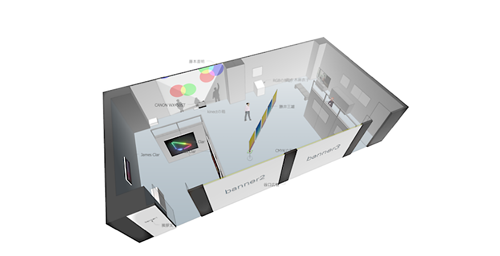
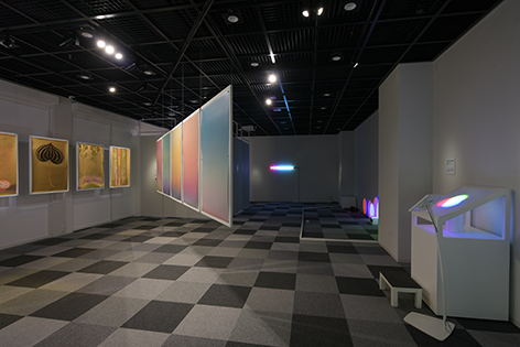
Assumed to be variously utilized, the gallery space has been designed as a modularized facility and environment with high functionality (Fig. 1). In particular, the units of 1.2-meter-wide movable walls can be flexibly arranged so that the space will be used for research presentations and contemporary art exhibitions. Gray is used as the base color of the space with consideration for color of content. As a result, every content in the space can be seen vividly.
The Design of the Gallery Space
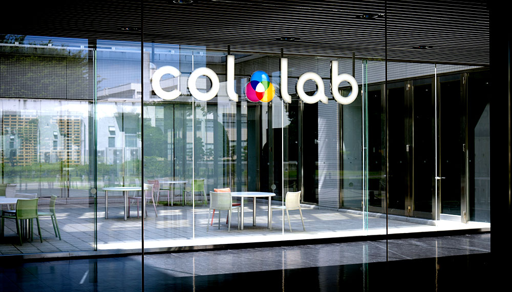
Gallery Logotype and Sign Design
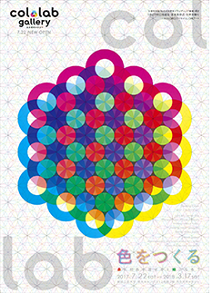
To increase the brand strength of the gallery, elements representing the nature of color were used in the “col.lab” logotype. “col” represents color and “lab” represents laboratory so that it is easy to recognize that the research center and gallery is a facility of color research.
Moreover, to obtain familiarity with audiences and to represent the characteristics of a research and education organization, the logotype was designed to be legible, friendly and intellectual.
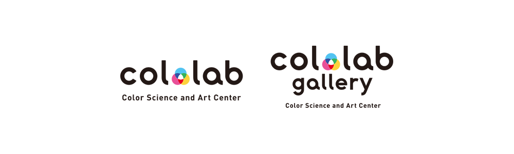
The Logotype of the Research Center and Gallery
Since the gallery is on the second floor of the building, a flow line from the outside of the building to the first-floor front space, stairs and gallery was carefully designed. For the stairs, Munsell's color system was adopted to represent the academic characteristics of the galley. It succeeded in combining visitor-friendly information design with the effect of enhancing visitors’ expectations of the gallery.
The logotype and sign design were designed by Masaaki Hiromura, a professor of the visual communication design department of the university.
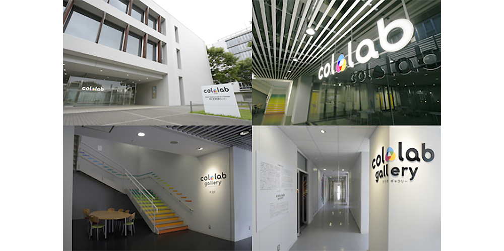
The Sign System of the Gallery
Public Relations Activities and Merchandise Development
Leaflet Design
With the cooperation of a designer, Sadatomo Kawamura, we produced and distributed posters and leaflets for the first exhibition publicity with the design concept of "the fusion of science and art through color". Furthermore, in order to stimulate the intellectual curiosity of visitors, a six-page leaflet that explains the purpose of the exhibition, outlines of each participating artist's work and profile, and presents details about the three primary colors of color light and color material was designed. With these printed materials, the activities of the gallery will be advertised and accumulated as a record.
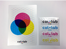
Plastic File Folder, Bookmark
In addition, we developed merchandise (plastic file folder, bookmark) to spread the fun of colors.
Yellow and cyan were printed on the surface of the plastic file folder, and magenta was printed on its reverse side. If the folder is empty, it becomes the three primary colors of cyan, magenta and yellow (CMY), and when a document is in the folder, it becomes the TPU logotype. It can be said that it visualizes the branding of our university as a color research institute. Likewise, the idea of the bookmark is basically the same as the folder. When three pieces (CMY) are overlapped, it becomes the original col.lab logotype. In this case, while having them freely play in the three primary colors of the color materials, we also remind visitors of the logotype at the center, strengthening the brand power.
"Creating Colors" Exhibition
“Creating Colors” Exhibition
An exhibition titled "Creating Colors: What Color can become Green by Mixing with Red?" has been held from July 22nd, 2017 to March 17th, 2018. As the introduction of the first exhibition, it provides contents to consider how colors are treated in various arts and design expressions.
How does the color of our surroundings get its color? In our everyday life, we are not conscious of the mechanism and process in creating the colors surrounding us, such as the color of a magazine's photo, the color of clothes, the color of light. However, knowing more deeply how the colors of various things are generated, visitors will recognize the wonder of the color world and the depth of the color and the pleasure.
In this exhibition, we planned to explore the process and mechanism of color creation through art and design works in various fields such as interactive art, light art, printing, traditional crafts and so forth.
Exhibited Works
Light Art (James Clar)
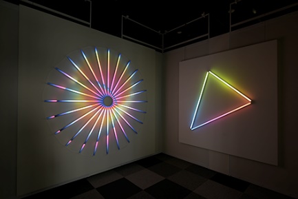
Light Art Projects by James Clar
The media artist James Clar is exploring the influence of media and technology on the recognition of culture and identity. One of Clar's works is a 3D display cube that contains 1000 LEDs soldered in a patented wiring matrix configuration. He is a new generation of light-focused artists from Dan Flavin to Olafur Eliasson. In this exhibition, his works focusing specifically on color have been presented.
Interactive Art (Naoaki Fujimoto)
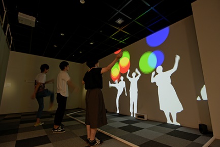
Visitors Playing with Interactive Art by Naoaki Fujimoto
An interactive art work in which participants can play with balls of the three primary colors of red, green and blue light projected on the wall with their shadows. As balls of different colors overlap, various colors are produced by the synthesis of light colors (Fig. 7). This art work occupies an important position as an experiential educational work.
Color in Printing (Mitsuo Katsui)
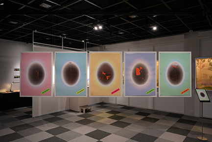
Fig. 8 Limits to Growth, Five Set of Posters by Katsui Mitsuo
The work implies "Limits to Growth" with an egg which is a metaphor of the Earth (Fig. 8). The data used to depict the shell of eggs are 60 million pixels, realizing high resolution image quality with the performance of sensors and lenses. Furthermore, it uses advanced printing technology of two more special inks to create a smooth gradation exiting in the light space.
Color in Printing (Hiroki Taniguchi)
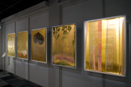
Five Set of Posters by Hiroki Taniguchi
The author has long been committed to gold, dreaming of using golden paper or gilded ink to create works. In 2006, in collaboration with the printing director of the "Graphic Trial" sponsored by Toppan Printing Co., Ltd. [1], he pursued golden expression in offset printing.
Traditional Colors (Maiko Sasaki)
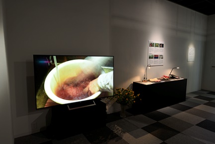
Beni by Maiko Sasaki
A document that carefully follows the generation and purification processes of Beni (red) from ancient times in Japan.
It beautifully depicts the process of purifying a little red pigment contained in a yellow safflower with a filament of hemp. This experimental film work describes the secret of the special beauty of red through the process of refining transparent red.
Mechanism of Color Systems (students of Software Design Course, Department of Interactive Media)
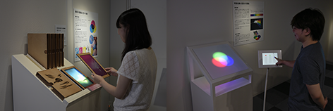
Devices Explaining the Mechanism of CMYK (Left) and RGB (Right)
Through this work, students participate in exhibition projects. Making use of young sensibilities and intelligence, we aim to make the gallery a place where students can grow.
Using the “three primary colors of material” device, visitors can experience a full-color printing scheme by overlapping cyan, magenta, yellow and black (CMYK) plates. On the other hand, using the “three primary colors of light” device, users can adjust the brightness of red, green and blue lights on an iPad and the device, and by mixing these colors, numerous colors are produced.
Both devices were designed for kids, so that they could gain new experiences and surprises by manipulating the devices. As a result, these works met with a favorable evaluation by visitors.
Students presented various ideas on how to design user experiences, and voluntarily managed the schedule to finish the work.
Hands-on Workshop for Creating Colors
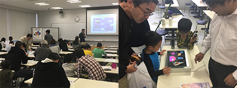
Workshop View
As a related project of the exhibition, two hands-on workshops titled Let’s Make a Color Mixer and Let’s Enjoy Polarized Color were led by the Department of Media and Image Technology, Faculty of Engineering, in which participants are encouraged to move hands to create colors. In this workshop, participants can learn scientific principles, as well as having an interest in the mysteries of creating colors by themselves.
(1) Let's Make a Color Mixer
The color mixer is a DIY tool kit for leaning the principles of the three primary colors of light.
They build a simple circuit and light up the three LEDs of red, green and blue, mixing the three lights by turning the knob of the resistor to produce various colors.
(2) Let’s Enjoy Polarized Color
This workshop utilizes polarization, which is a physical phenomenon of light.
When a cellophane is interposed between two polarizing plates, light refracts in complicated directions and changes to various beautiful colors. It is effective as a hands-on learning for elementary school students in particular because expressions like stained glass color can be obtained easily.